Maintaining Responsive Content
Introduction:
Thank you for creating a responsive website with MembersFirst. In order to help your club's team stay up-to-date on what responsive means, we've included this best practices guide to help you with how content should be formatted going forward.
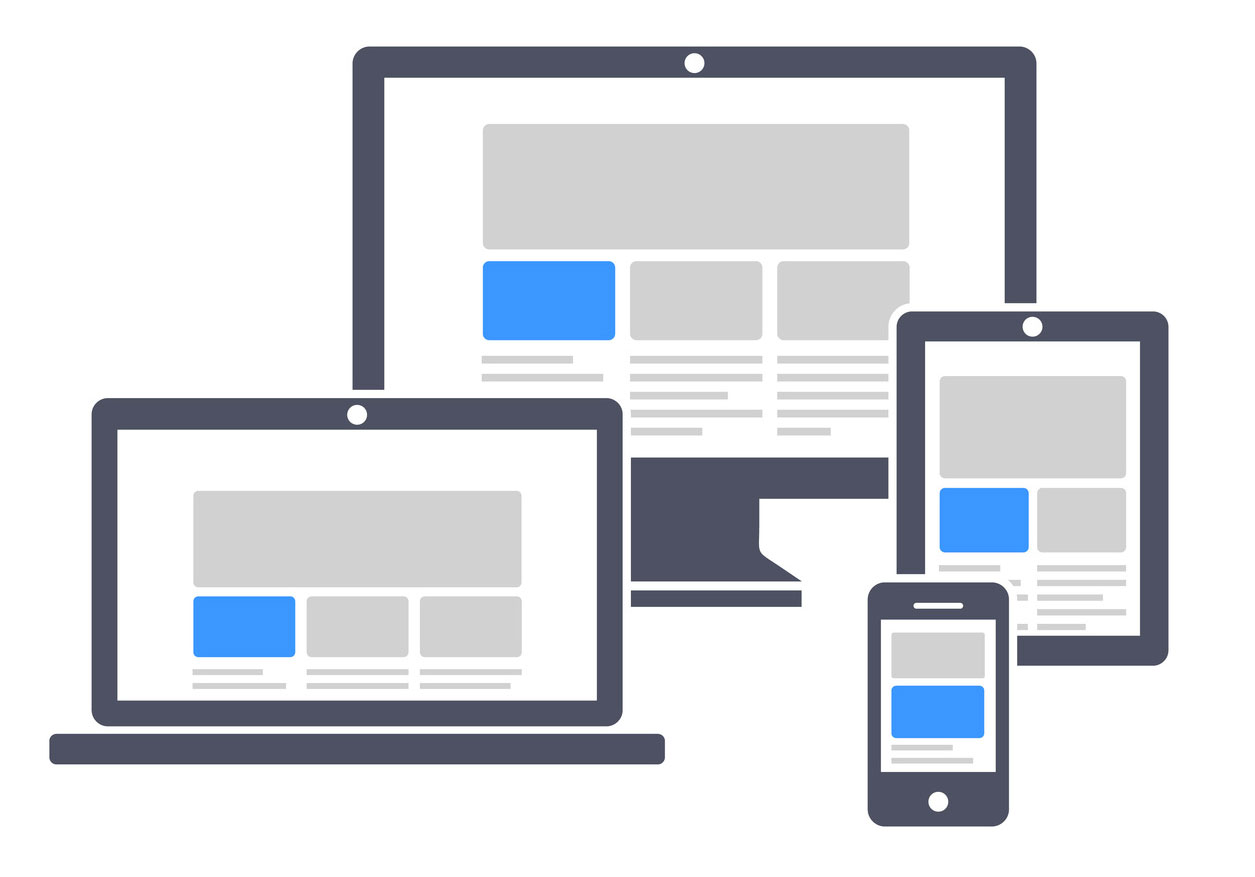
What is Responsive Web Design?
The website you're viewing should adapt to whichever screen you are looking at it on, such as a mobile phone, a tablet, a laptop or a computer.
How important is it for my club?
If your website is not catering to a mobile audience, you are potentially turning business away when users get to your site.
Table Of Contents:
In this guide we will cover Responsive Design best practices in the following areas:
Images
It is recommended to center the object/subject in the photo. There will be a greater chance that the image will not lose context when viewed on various devices.
NOTE: Not all devices will see the same dimensions of the image (Ex. interior page banners will lose part of the left/rightmost portions of the image as screen sizes change) so make sure important parts of the image (i.e. people) have enough breathing room around them.
Adding Images to MRM
For steps on how to upload and manage images to your website, please visit this article.
When adding images into the editor we encourage you to take these few extra steps to ensure its compatibility on mobile devices:
| Right click the image and select "Properties" |  |
| Remove the value in the width field. This should clear the height field automatically. | 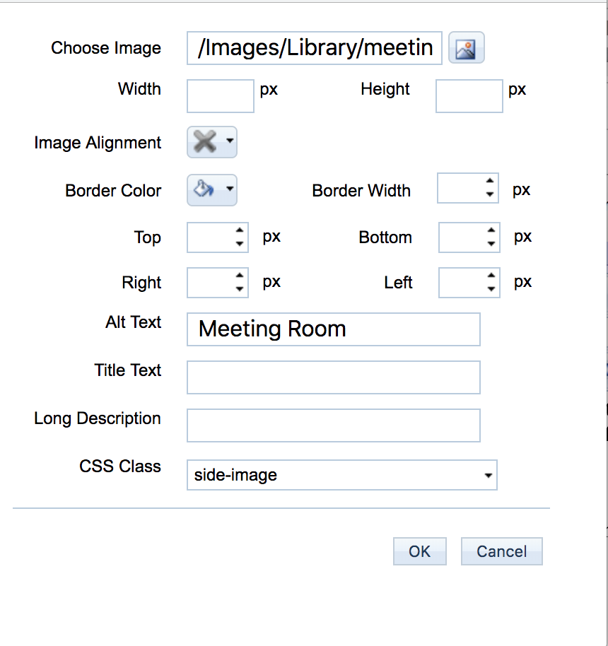 |
| Enter 100% into the width field | 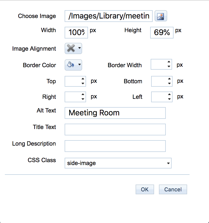 |
| Click OK | 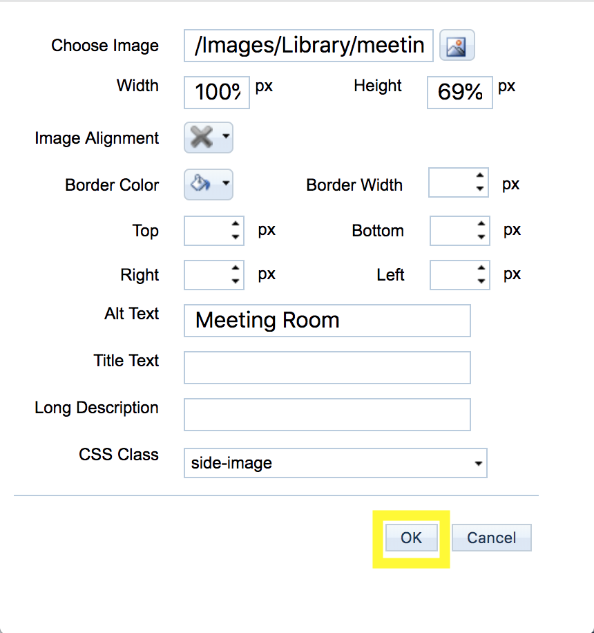 |
When to Use .jpg, .png, or .gif
JPG/JPEG
- Best for detailed static images w/out transparency (i.e. photos)
- Can be read by web browsers, email clients, and mobile devices.
PNG
- Best for simpler static images that may have transparency (i.e. logos)
- Cannot be read by all email clients, should be avoided in email situations
GIF
- Best for animated images (sometimes transparent), but with a much more limited color palette
- Less accessible, should not be used in most circumstances
Note: Images should always be compressed (aka smaller file size) so it loads faster for users on limited or slower data connections (esp. mobile). Whenever possible, you should avoid using images to convey important information (i.e. event flyers). If the image is absolutely necessary, please make sure to also add the important details as text in case the image does not load for a user or if the image accidentally gets removed or deleted.

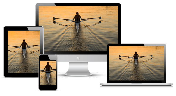
Big Pictures on Small Screens: Remove, Resize or Reorganize
https://www.nngroup.com/articles/big-pictures-small-screens/
When using large-screen images on smaller screens, remove images that don't add information. Then, pay close attention to cropping, scaling and placement.
Remove Images
This is not to say that small screen designs should not have images; rather, they should have meaningful images. With any image, consider its information value: how much information it adds to the page. If the value is high, keep the image. If an information-carrying image is too big for responsive design, appropriate scaling, cropping, and placement can make it suitable for a small screen. But if the image does not add value, removing it can result in a better experience.
The image is a good candidate for removal in the mobile view if it:
- is unclear at a smaller size
- cannot be cropped to the right dimensions while retaining the meaning
- is being obscured by the accompanying text
- is increasing the amount of scrolling on the page, or
- does not add significantly to an understanding of page content
Resize or Crop the Image
Images in responsive designs must fit screen dimensions while retaining clarity. Large images may need to be cropped to focus on a single most meaningful detail. The orientation of an image may change from landscape to portrait to fit the screen.
For the best experience viewing images on mobile, we recommend using an image compression tool such as https://tinyjpg.com. This is a useful free tool for compressing images to optimize for use on your website.
For resizing and cropping images, you can use http://www.picresize.com/batch.php. (Instructions here).
Edit or Move the Text Associated with an Image
Sometimes, editing an image will not be enough: you may need to also change the text associated with it. Shorter text will be easier to place over, next to, or near an image, while also minimizing scrolling.
In the Full Page Text editor in MRM, you can set a custom CSS Class for a "side-image" in order to have the image wrap around a body of text:
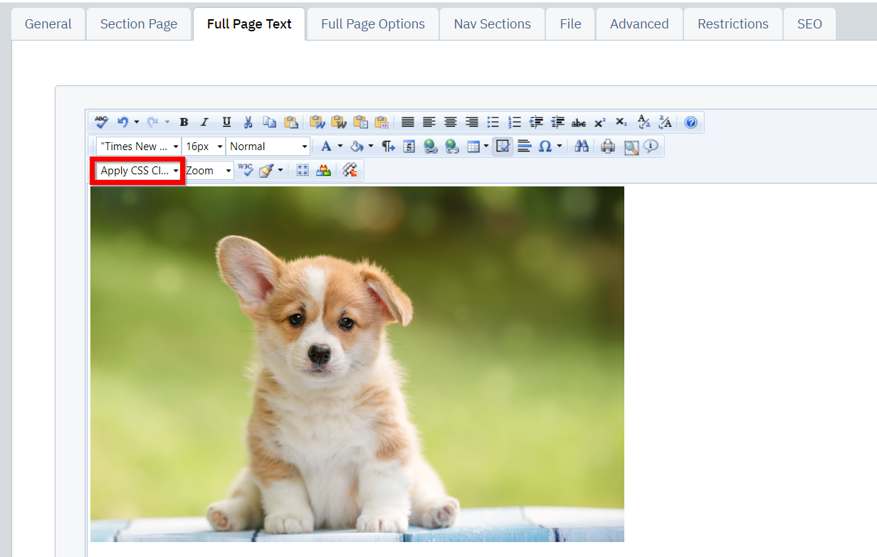
| Click on the image you would like to apply the CSS to and select the "Apply CSS" button in the top-left of the editor |
|
| From the drop-down menu, select "side-image" | 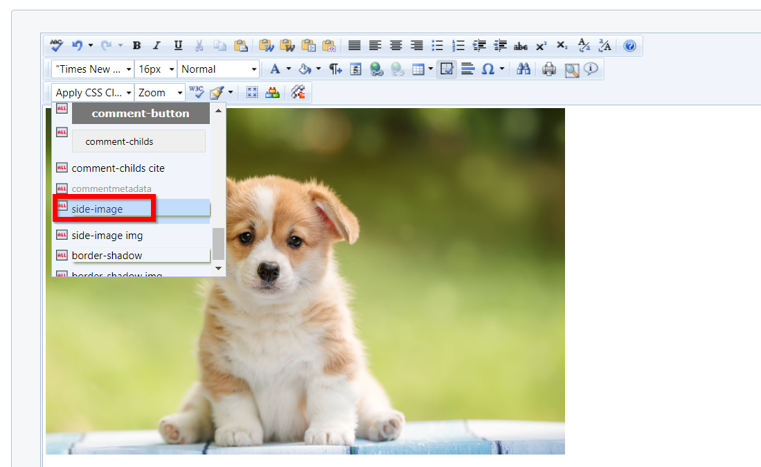 |
| The image will now be wrapped to the right of the text in the editor. Click "Save" to publish this layout to your website | 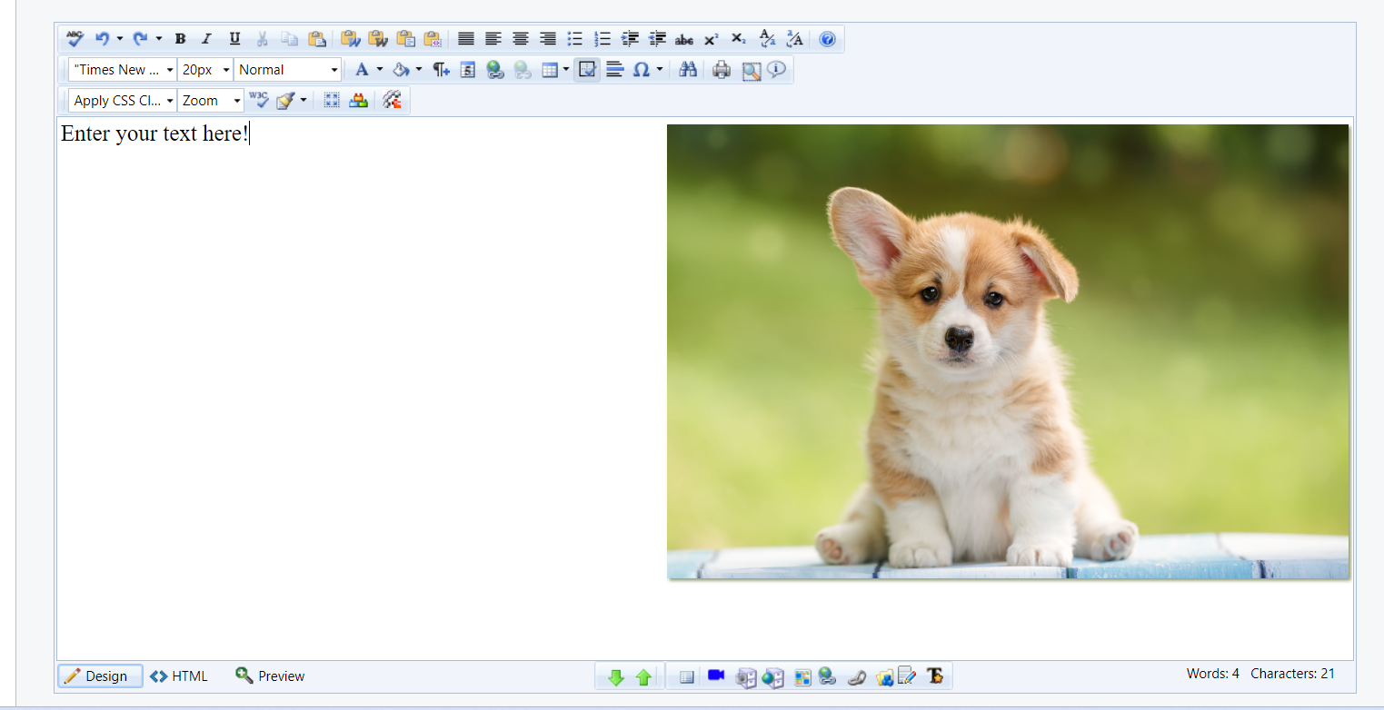 |
Video
It is recommended to center the object/subject in the photo. There will be a greater chance that the image will not lose context when viewed on various devices.
How to Embed Video
Videos are a great way to incorporate interactive content on your website. Before you can embed videos into your website, you must first upload the video files to a video host such as YouTube or Vimeo.
Note: Video playback is not supported in email. Instead, follow this guide to set up a link to the video on your website after completing the steps below.
| Copy the embed code from your video host, using the instructions below: | 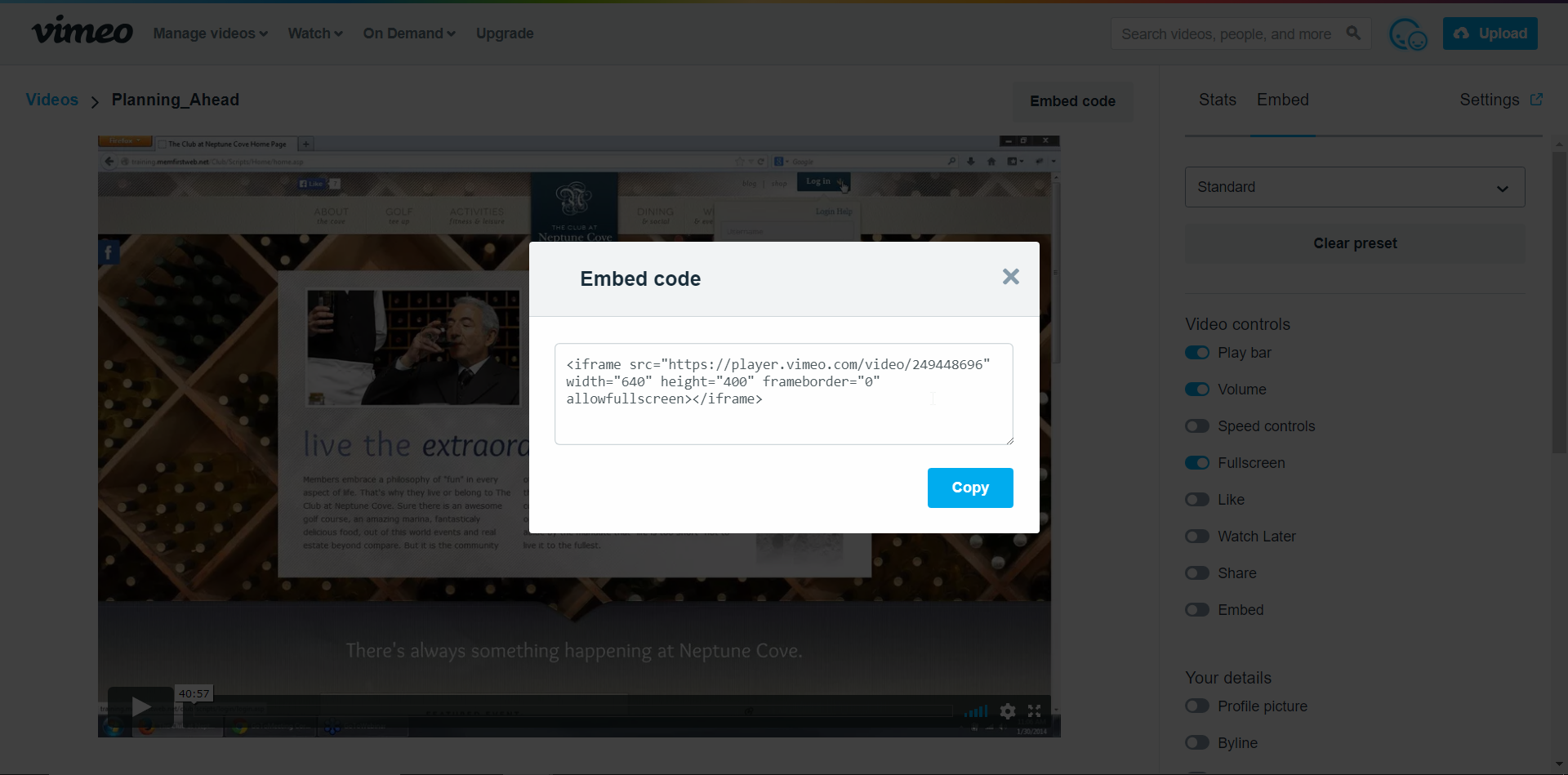 |
| In the editor, create a space where you would like the video to appear and type "Insert Video Here" in place of the video. |  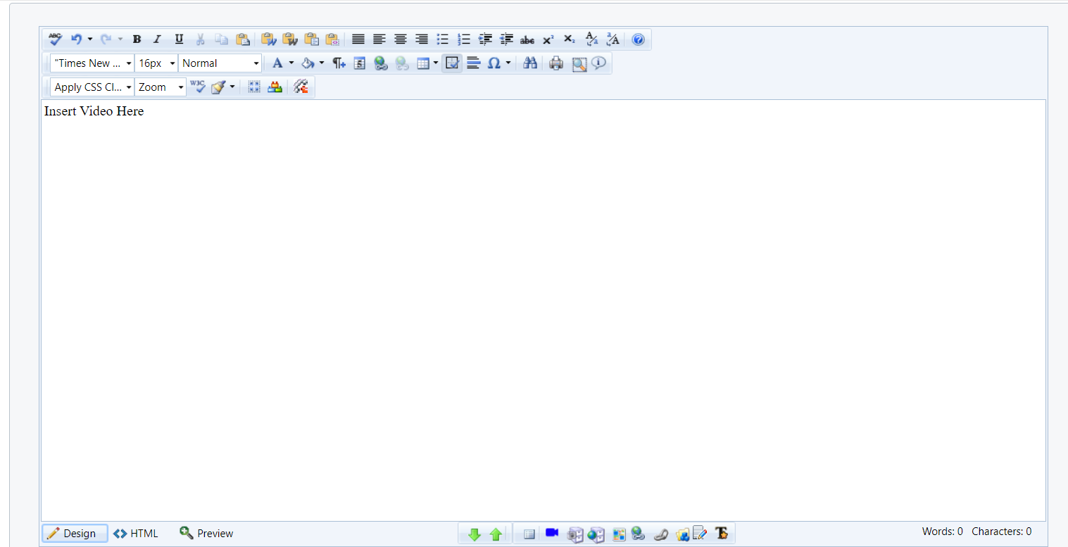 |
| Click on the HTML button to switch into the HTML view. | 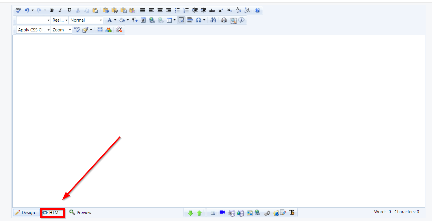 |
| Search for "Insert Video Here" within the code and select the text. Note: Use your browser's search function (CTRL + F or Command-F) to easily locate this placeholder text. |
 |
| Press CRTL + V or CMD + V on your keyboard to paste your video's emebed code. | |
| Click on the Design button switch to the Design view and verify the video appears. | 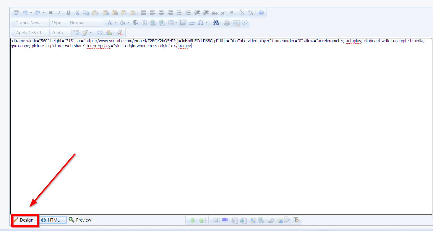 |
Adding Responsive Embeddable Videos
To embed a Youtube, Vimeo, or Dailymotion video on a page, use Embedresponsively.com, otherwise the video could get cut off on smaller displays. Simply enter the video URL, select the media source, and click embed. A video preview will appear along with the responsive embed code. You can now copy the embed code and paste it into the editor (be sure to have the HTML view selected!) to display the responsive video on your site.
Additional Content Tips and Tricks
Removing Tables in Favor of Lists
Tables are tricky. A single row of a table needs to be kept together to make any sense to the end user. Keeping that content inline on smaller screen sizes can be a real struggle for Web Admins. And although tables can change in width, they can only get so narrow before content in a table cell will start to wrap unnaturally (or stop resizing with the screen entirely.)
As you can see below, neither option is ideal.

Responsive design is all about adjusting designs to accommodate screens of different sizes. So what happens when a screen is narrower than the minimum width of a data table? You can zoom out and see the whole table, but the text size will be too small to read. Or you can zoom in to the point of readability, but browsing the table will require both vertical and horizontal scrolling.
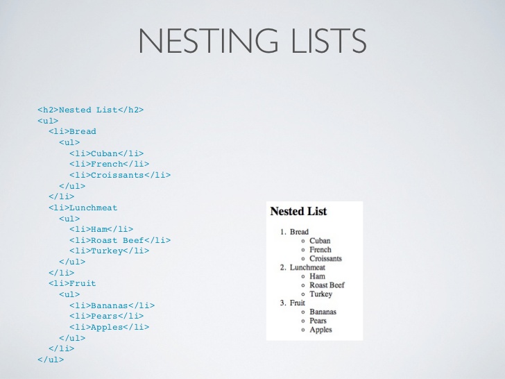
Instead of going through the headache of trying to make tables work on a responsive site, we recommend breaking content into multiple lines via nested lists, or using spaces to separate content.
How to create a nested list in MRM:
| In the Full Page Text editor, you can create both Bullet Lists and Numbered Lists. | 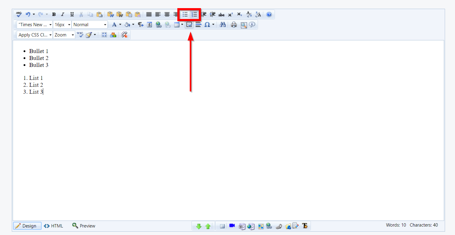 |
| Add the text you want to be formatted as a list in the editor. |  |
| Highlight the content you want to turn into a list. | 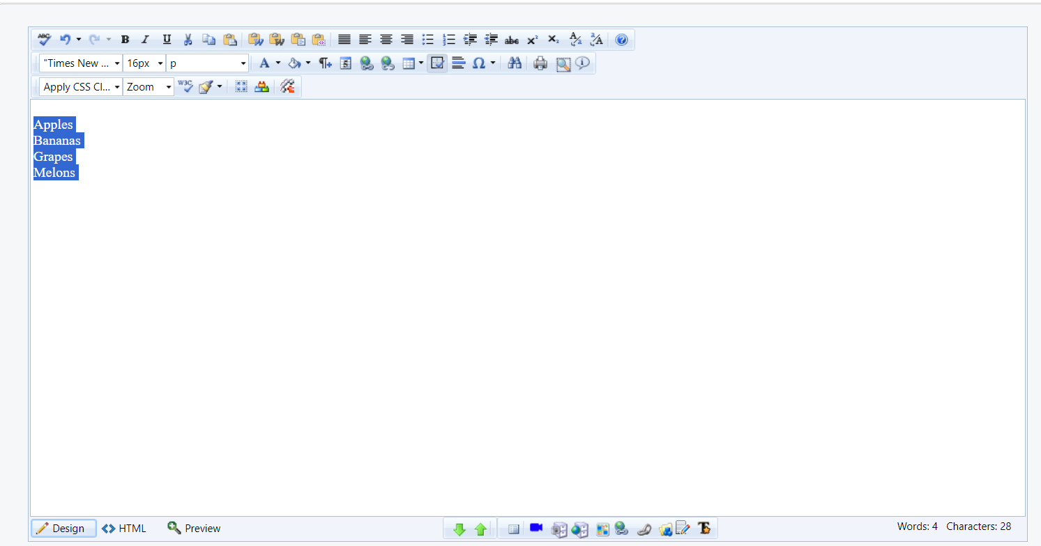 |
| After highlighting the content, click on the Bullet List button and this will create a bullet list of the highlighted content in the editor. Click Save to publish this to the site. | 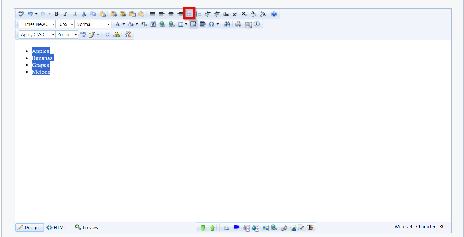 |
| After highlighting the content, click on the Numbered List button and this will create a bullet list of the highlighted content in the editor. Click "Save" to publish this to the site. |  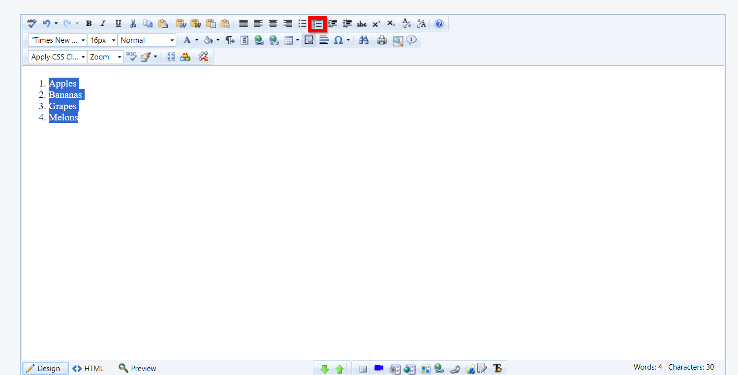 |
| You can also use the Indent button in the Editor to create a nested list. | 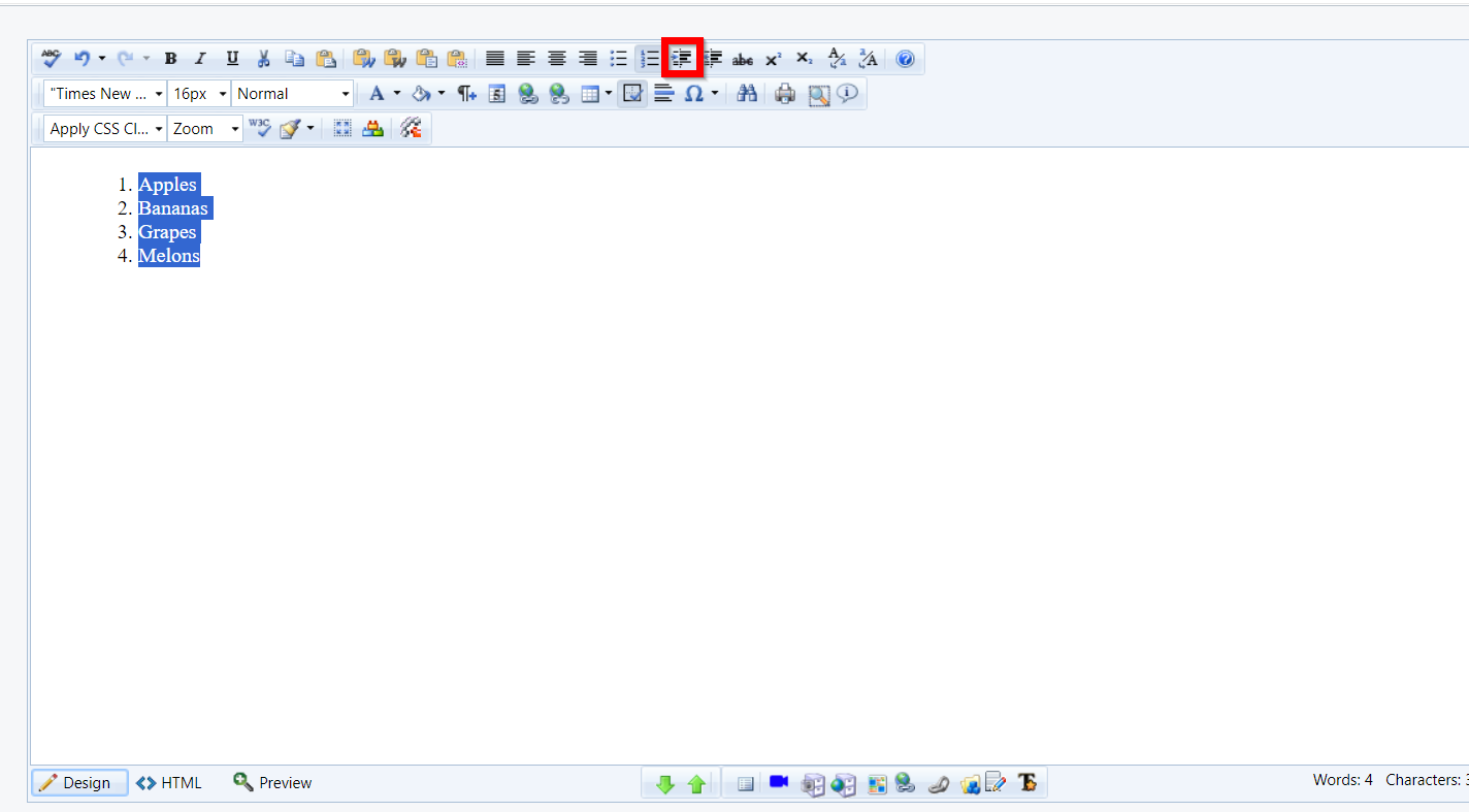 |
| Clicking "Save" will publish this to the site. |  |
For Advanced Users: Using Nested Lists in HTML
If tables are an absolute must for you, then at the very least you must ensure that the table has a width of 100% or less - and you can't use pixels (px) as your unit! If you continue to have difficulty with the formatting, then you should check each table cell to ensure that it's width is not defined (blank) or uses a percentage as well. You can check these details by right-clicking the table and/or cell and going to table properties or cell properties.
Doing this will not guarantee that all users will be able to see the content on different sized devices, so be warned!
Using the Table Wizard
| In the editor, click on the Table icon followed by the "Table Wizard" link | 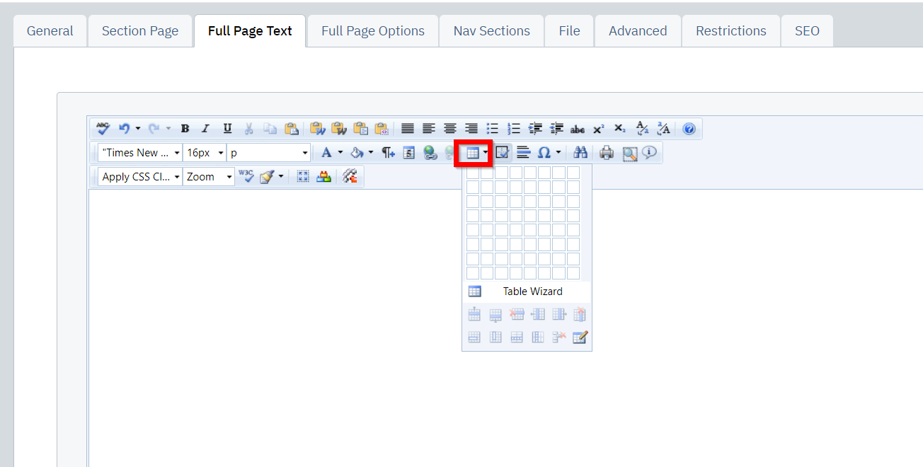 |
| Click on "Table Properties" | |
| Enter 100% into the width field | 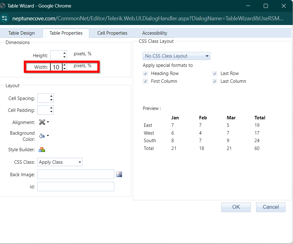 |
| Click Save |  |
Use Your Site's Native Styling
The text formatting in your documents and inserts are automatically styled to match the look and feel of the website. Although content editor provides many options for changing font, size, and color of text, you should not use these to regularly style your content.
Using your own styling on a page adds additional span tags, spacing issues, alignment issues, and font size issues that can all negatively affect how a page renders on different device sizes. Native tags, such as headings and bulleted or numbered lists, are styled within your site already, and should not be overridden by admins for on-page use, else the content could render incorrectly.
Other Content Layout Tips
Headings are a great way to structure content within a page on your website. It also helps in consideration of those using text readers and search engines.
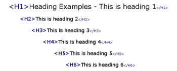
- Avoiding more than one H1 tag
- H2 tags for section headings (i.e. on a Weddings & Events page: Weddings, Corporate Events, Private Events, etc)
- H3 and so on for subsections within each content area (i.e. w/in a weddings H2 section: Event Venues, Package Options, etc.
- Wrapping paragraphs in
tags.