Updated Admin Tee Sheet Interface
The admin tee sheet has a new look and feel, and will be updated for all MF Tee Times clients very soon! This update contains no functionality changes, just a fresh update. See below for details of the changes.
Updated Color Scheme
The admin tee sheet visibly looks different due to a change in its color scheme. Overall, we have removed the dark background colors of the primary navigation and header area that sits above the tee sheet with a lighter tone. Primary navigation now reflects a light grey while the header background reflects a white background.
Before

After

Calendar / Date Picker
Based on user feedback, we updated the calendar to reflect one week rather than three months.
- The current day is highlighted in blue and is positioned in slot one (left side). This provides a full week ahead no matter the day.
- Users can use the arrow buttons on the left/right side to move forward or backwards one week at a time.
- Users can use the ‘Today’ button to load the current day’s teesheet.
- Users can use the calendar widget to view a 2-month calendar.

Actions Dropdown
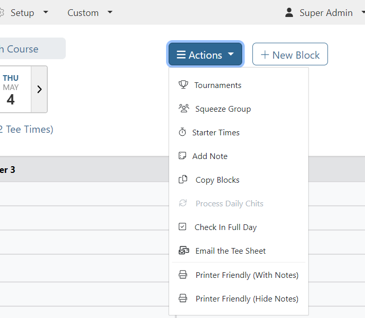
Perhaps the biggest visual change to the header is the new ‘Actions’ dropdown located to the right of the calendar.
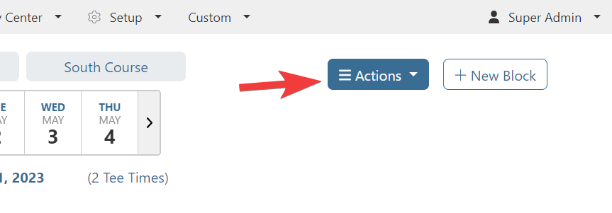
Previously, this area was the location of multiple buttons like Create Block, Squeeze Groups, and Starter Times. Due to planned tee sheet enhancements like Drag and Drop and a new option to email the tee sheet, the Actions dropdown is now home to all of these existing features and allows us to easily add new options in the future.
Drag and Drop
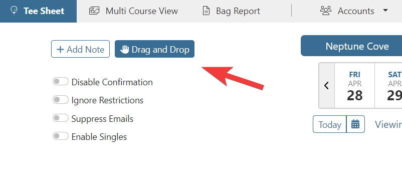
Drag and Drop functionality on the admin tee sheet is currently in Beta testing and will be rolling out to all MF Tee Times clients very soon! To account for various drag and drop features, the header area needed a dedicated spot to allow users to manage various settings, which will be located to the left of the one-week calendar.
Maximizing Space
One goal with the updated look and feel was to better utilize the real estate on the tee sheet. One area where this has been achieved is the tee sheet itself.
Full Width Tee Sheet
The tee sheet is now full-width based on the number of player slots.
Before
Large area to the right of Player 4 was unused.

After
Player slots now maximize the full-width of the tee sheet.

Block Buttons
All buttons associated with managing blocks now display in a single row
Before
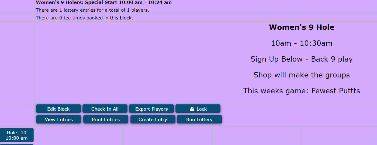
After
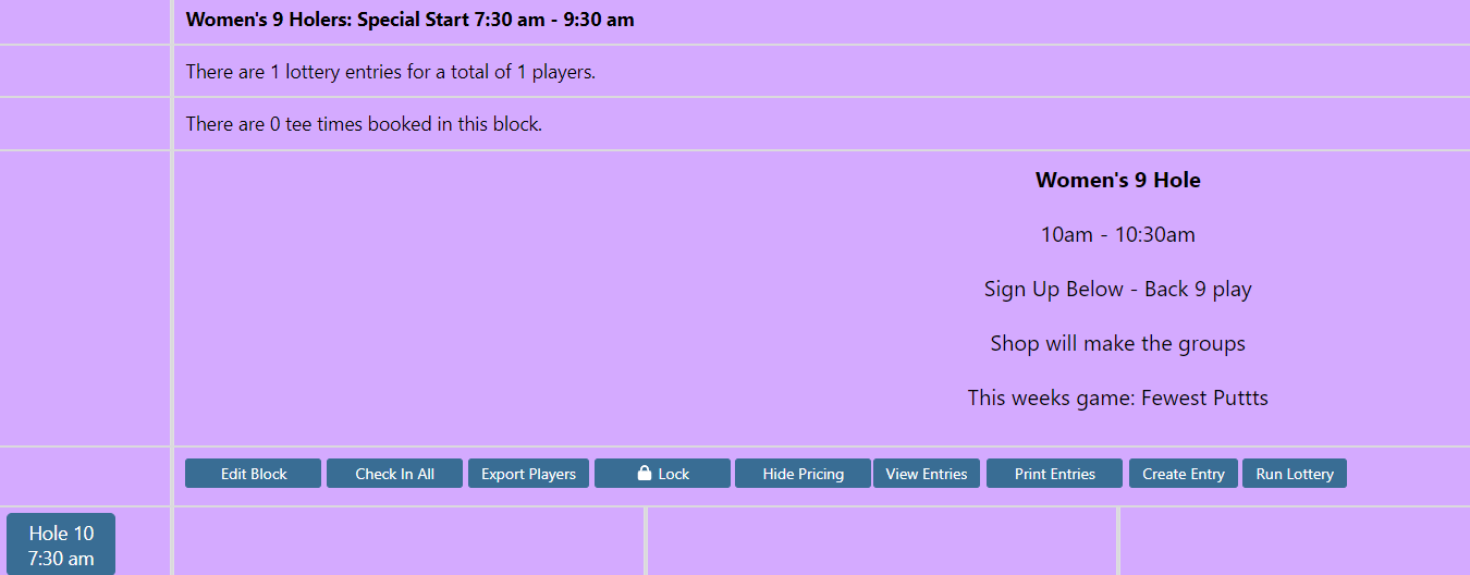
Tee Time Quick Change Buttons
To account for drag and drop functionality on the tee sheet and planned enhancements related to doing more on the tee sheet without needing to click into a tee time, the area that houses the quick change buttons has some new additions.
Like the Actions dropdown in the header, we create a new quick change button that will allow us to add new options. Pace of Play now lives in this action dropdown button.

Updated Icons
In general, wherever possible we updated existing icons and added new ones.
New icons were added to the primary navigation
![]()
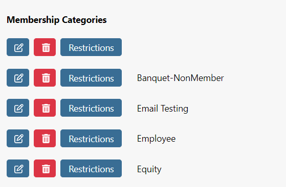
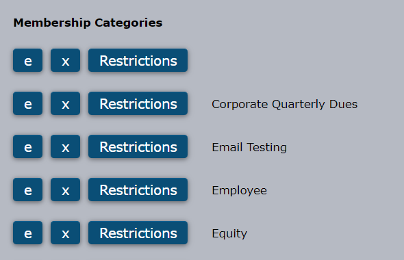
Existing icons like ‘Edit’ and ‘Delete’ were updated
Before
Edit denoted with an ‘e’ and Delete denoted with an ‘x’
After
Edit denoted with a pencil/paper icon and Delete denoted with a trash can icon
