Using the EBuilder Editor
With the EBuilder template editor, admins can easily create and customize email templates in a user-friendly drag and drop interface. Let’s take a closer look at the functions available in the editor and how to use them.
|
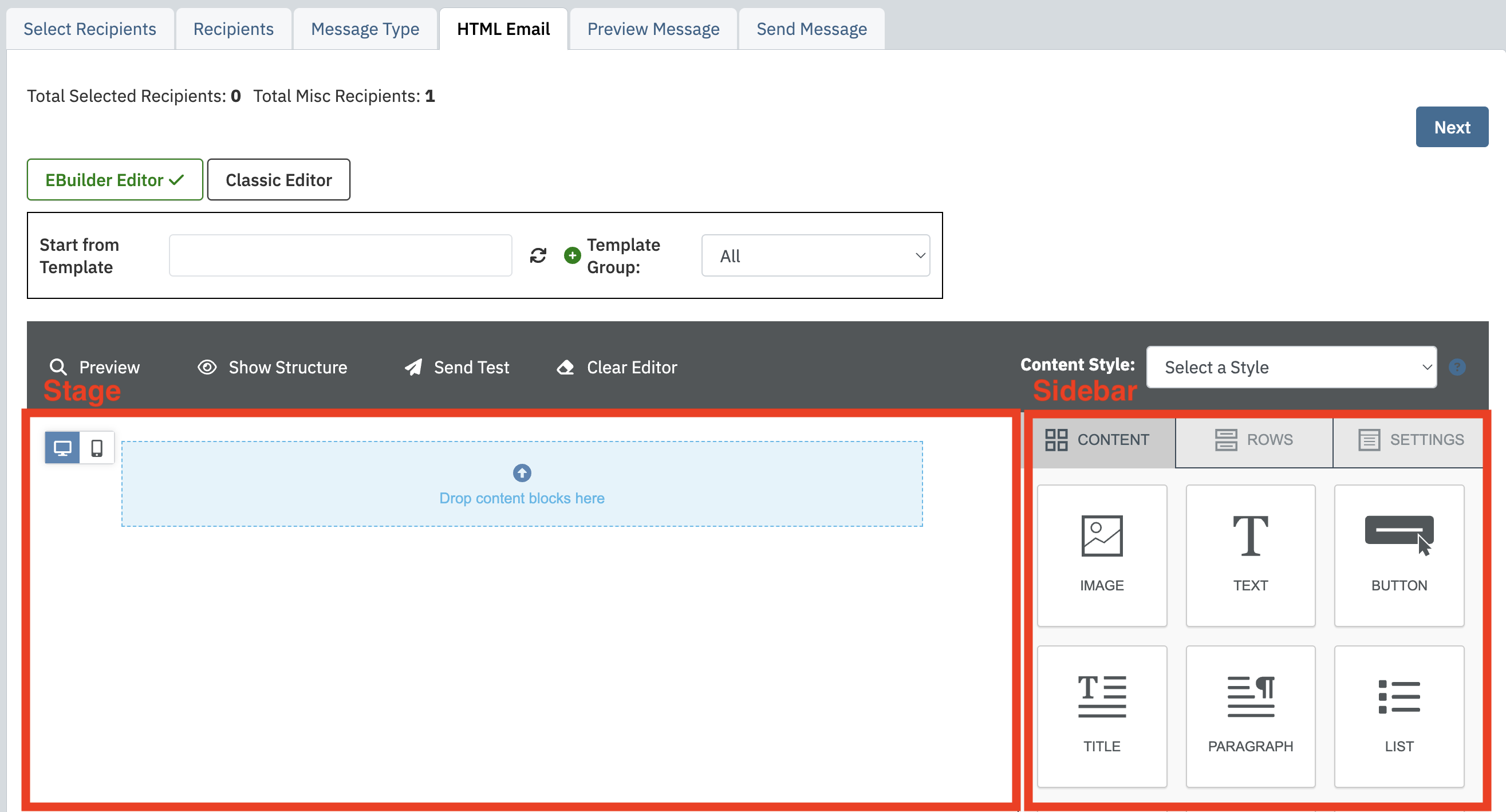
The EBuilder Editor interface is split between two main panels. On the left is the Stage, which displays the email layout itself where desired elements are added as the template is built. On the right is the Sidebar, where you’ll find draggable content types and customization options. |
|
|
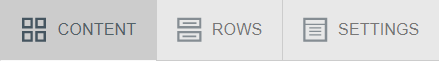
The Sidebar is split into three tabs: Content, Rows, and Settings. |
|
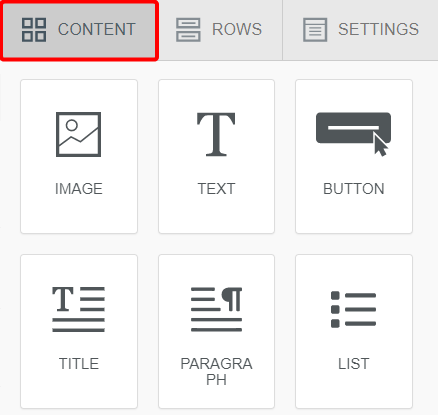
ContentOn the Content tab, you’re presented with all types of content available for use in your template. Below, we’ll give an overview of each content block. |
|
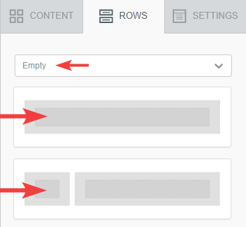
RowsThe Rows tab is where you select the structural pieces of your template. In the "Empty" Rows category, there are a number of pre-built row structures to use which contain content areas varying in number and width. Simply drag your row selection over into the stage area for use. You’ll need to have at least one row in place in order to start dragging in content blocks. Brand new templates include a simple single column row by default so you can get started right away |
|
|
Note: If you wish to use a single row for more than one content item, you can do so by dragging a new content block to the top or bottom of an existing row. |
|
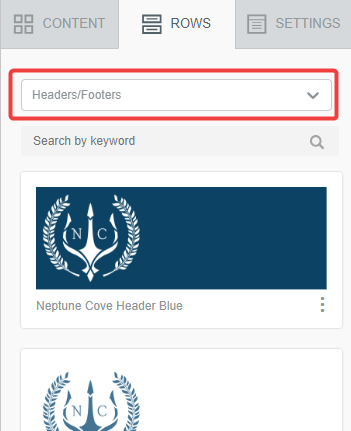
Default RowsSelect "Default" in the Row Category dropdown to view pre-built rows with content and styling options already in place. Browse the available selection for one that fits your needs and drag it over into your template to use and further customize. | 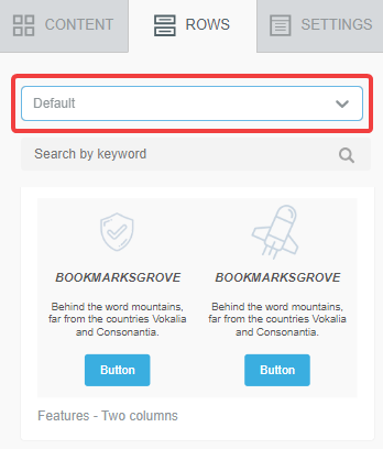 |
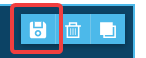
Saved RowsYou can also save your own fully designed rows for future use. For instance, if you want to establish a consistent header or footer, you could create it once, save it as a row, and have the option to pull it into any template/draft moving foward. Click on a row in your template and use the save icon to name it, categorize it, and save it for future use. Your saved rows will be available in the Row Category dropdown in the sidebar. |
|
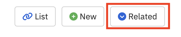
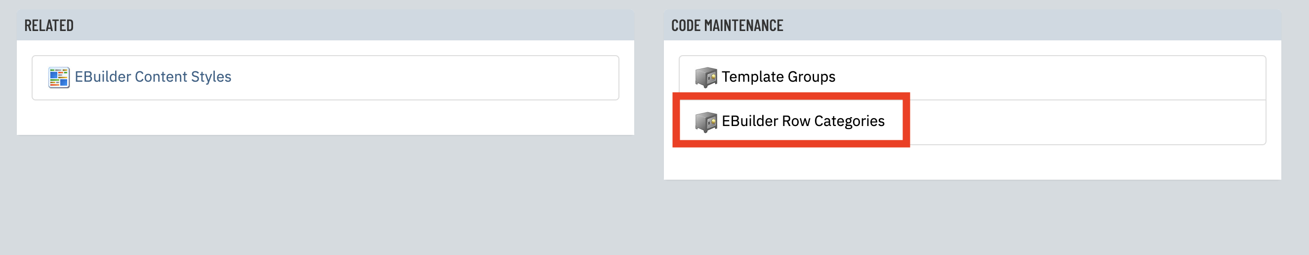
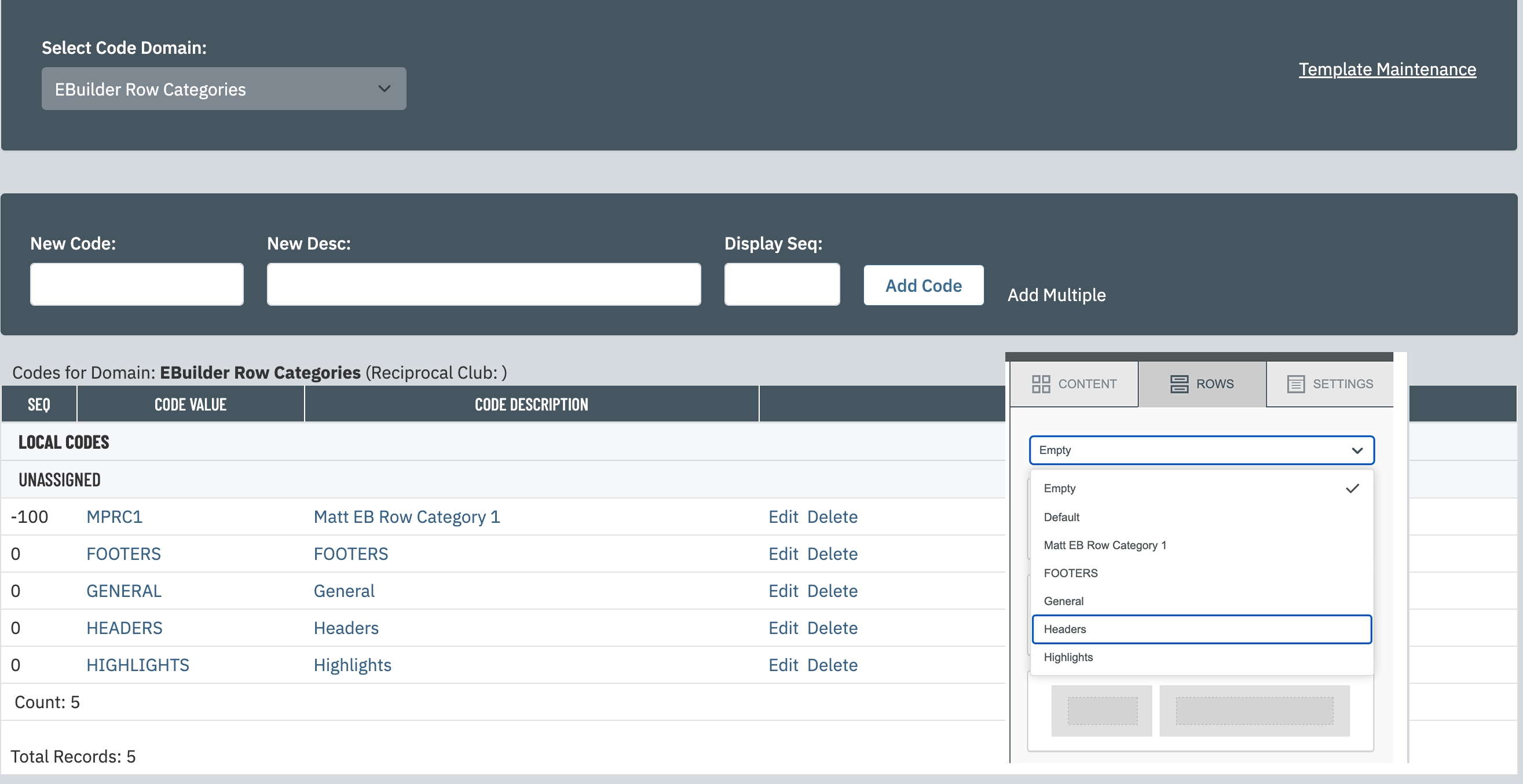
More with Saved RowsYou have the option of creating row categories to organize Saved Rows. To do this, click the "Related" button from Template Maintenance and select the "EBuilder Row Categories" link under Code Maintenance. Any categories created here will be available to save rows within and will display in the Row Category dropdown for browsing and selection. If you don't need to create your own Row Categories, you can save rows into the existing "General" category. |
|
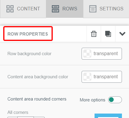
Row Customization
Clicking on a full row from the stage area presents you with further row customization options under “Row Properties”. Here, you can edit the row’s background color, the number and width of content columns, and more. |
|
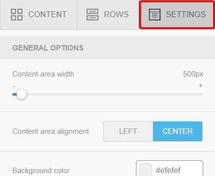
SettingsThe Settings tab allows you to customize the general display of your entire template, such as the overall width or background color. |
|
Content Blocks
Let’s take a look at each type of content block available for use in your templates.
Note: Each content type has its own subset of customization options that appear in the Sidebar when clicked from the Stage area.
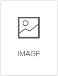
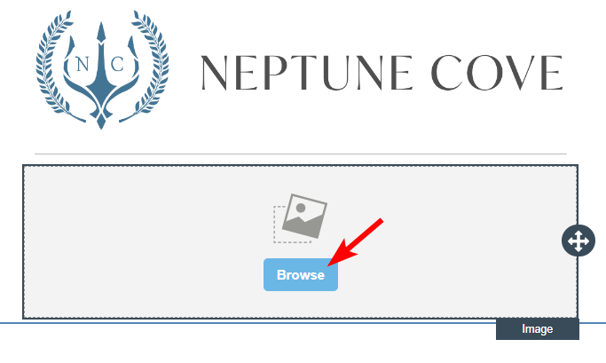
ImageThe Image content block allows you to select an image from your Image Library for use in your template. On an Image block, click the “Browse” button to open the Image Selector interface. |
|
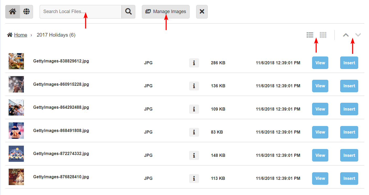
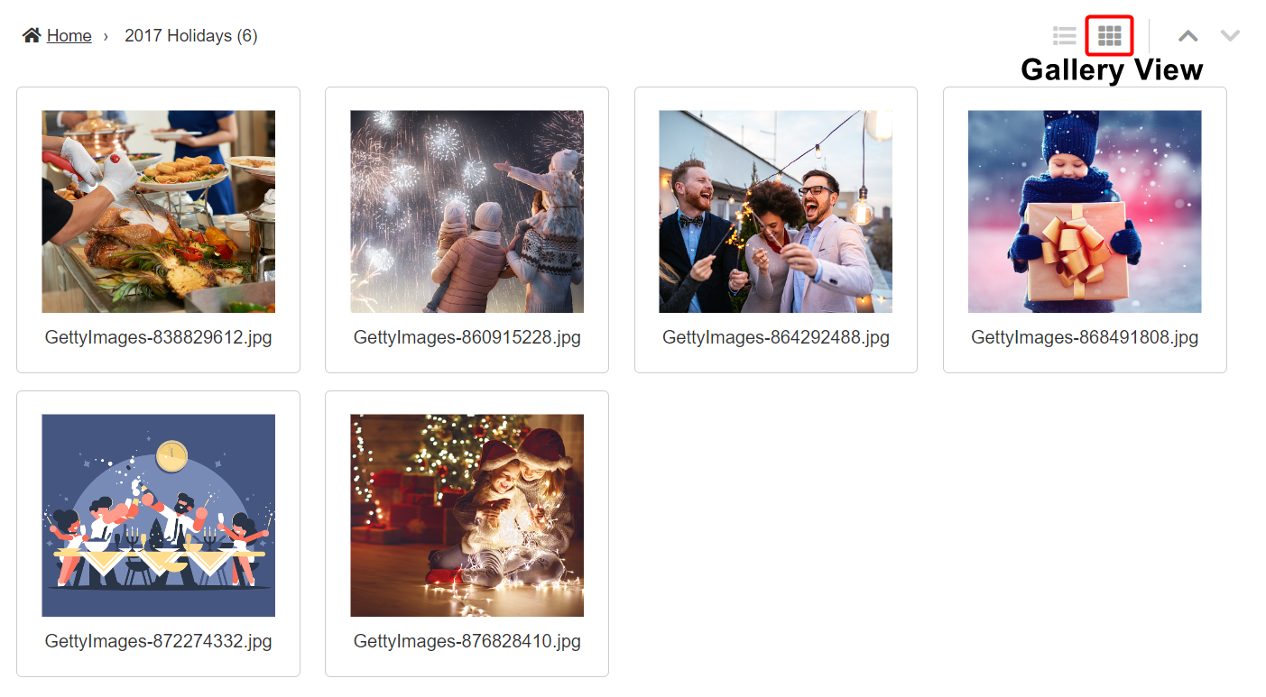
Image SelectorThe Image Selector interface allows you to browse for images to use. By default, the home icon You also have a search field to find images by image name and description. If you need to do work managing your Image Library folders and images, click the Manage Images button to be directed to the full Image Library module. There are also options to view in list view or gallery view. Gallery view allows you a better preview of the images as you browse for selection. To filter the results up and down alphabetically, click the arrows at the top right.
|
|
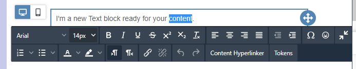
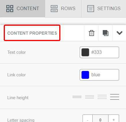
TextThe Text block can be used to create areas of text within your template. It’s particularly useful if you’re looking for a free form block of text that allows you to customize the styling at a granular level, right within the same phrase, sentence, or grouping of words. After clicking on your text block, you can start entering your text and see the full options provided in the in-template text editor. |
|
|
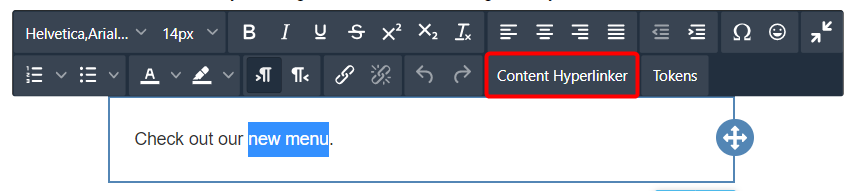
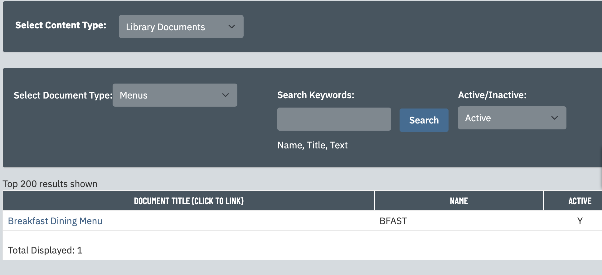
Clicking “Content Hyperlinker” from any text editor in the EBuilder will open the Content Hyperlink tool. This can be used to search for content for your highlighted text to link to. |
|
|
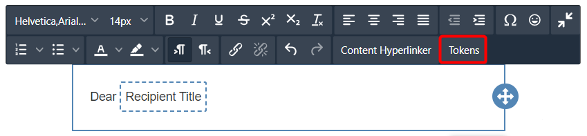
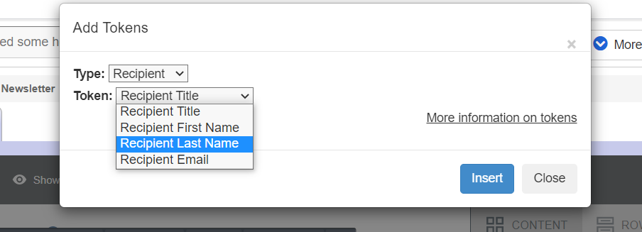
Clicking “Tokens” from any text editor in the EBuilder will open the “Add Tokens” dialogue, where you can pull in details to personalize your emails. |
|
|
Additional Text customizations are available in the right panel under “Content Properties” when a Text content block is selected. |
|
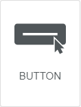
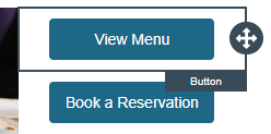
ButtonThe Button content type allows you to insert buttons into your template that will direct the recipient to a chosen URL or piece of website content. Click on the button from within the stage area to customize the text it displays. |
|
|
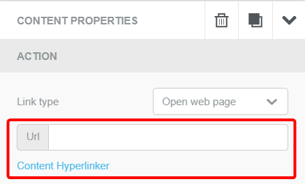
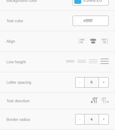
When a button is selected in the stage area, the Content Properties panel in the Sidebar presents customization options specific to the button content type. These include Url/Content Hyperlinker to dictate where the button directs to as well as font, button color, and border radius. |
|
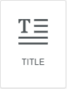
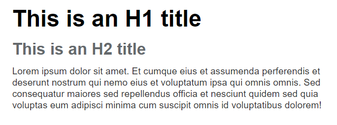
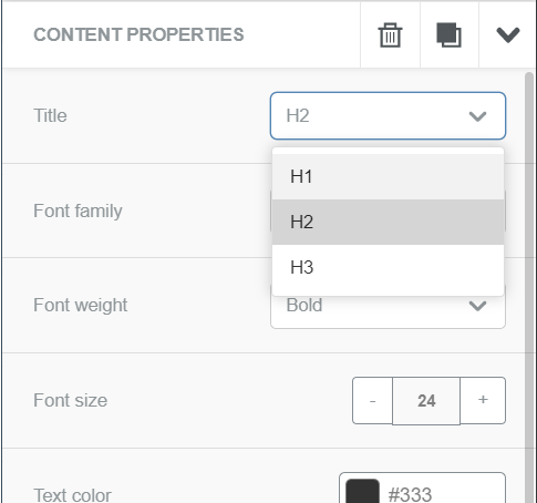
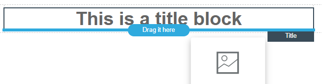
TitleThe Title block can be used to organize the content of your design with headings, establishing a hierarchy with H1/H2/H3 tags. |
|
|
Click on your Title from the stage area in order to change the text or edit the content properties in the sidebar, such as the heading tag, font family, font size, and text color. The Title block also allows you to link to content with the Content Hyperlinker and insert tokens for pulling in recipient data. |
|
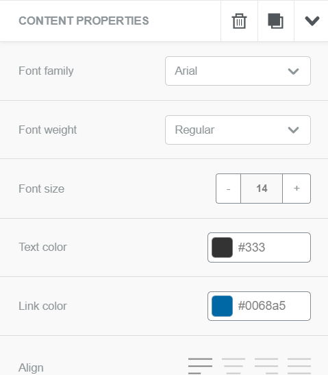
ParagraphThe Paragraph block is similar to the Text block, but provides convenient options for quick and consistent styling of an entire grouping of text all at once. |
|
|
All the text in a Paragraph block can be edited together to select font family, font weight, color, alignment, paragraph spacing, and more. This provides a quick way to change and assess the impact of the style choices on the overall template. The Paragraph block also allows you to link to content with the Content Hyperlinker and insert tokens for pulling in recipient data. |
|
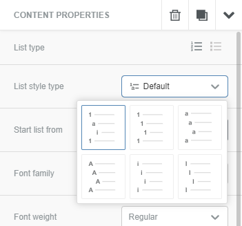
ListThe List content type allows you to present information in structured lists, while still providing the text style choices found in the Paragraph block. These can be presented as either ordered (numbered) lists or unordered (bulleted) lists. |
|
|
Clicking on a List content block within the stage area opens additional options under “Content Properties”, where you can change the List type, style, font, and more. |
|
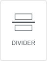
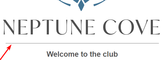
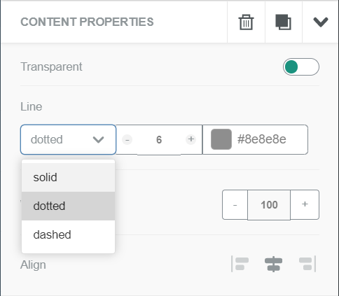
DividerThe Divider block is the first of two content types used as natural breaks in your design. It allows you to place a "horizontal rule (or line)" between pieces of content. |
|
|
Dividers can be customized to display different line types (solid, dashed, or dotted) as well as choosing height, width, and color. |
|
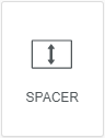
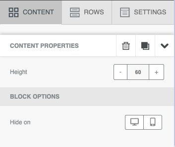
SpacerThe Spacer block is just like the divider, except it only adds space between pieces of content. You can control the height of the spacer after adding it to your message. |
|
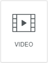
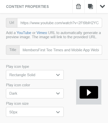
VideoUse the Video content block to easily attach a Youtube or Vimeo video to your email. Drag the content block into the stage then click on it. On the right you can paste in a Youtube or Vimeo URL and the editor will automatically grab a thumbnail of the video and overlay a play button on top. In the sidebar, you have the ability to customize the design of the play button overlay. |
|
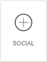
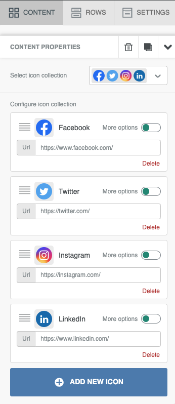
SocialDrop a Social content block into your email to quickly add icon links to all of your social media accounts. By default this will include Facebook, Twitter, Instagram and LinkedIn. Use the options in the Sidebar to change your icon display and links. You also have the option to add other built in social icons or add your own custom icons from your Image Library. This content block works great in the footer of most emails. |
|
 will be selected, indicating that you're browsing your club's local Image Library. You can also select the globe icon
  to browse images from the MembersFirst global Image Library.